This online identity manual was developed to provide clear design guidelines for uniform application of our visual style.
Our identity is not just the logo. It’s a unique design scheme composed of various components that work together to create our distinctive visual style. It is essential to follow the guidelines in order to achieve strong and consistent application of our identity and build strong awareness and recognition of our brand.
To download a folder containing all logo assets, click here.
Contact details
As a fundamental source of information about our design standards, this online identity manual aims to introduce the design scheme in a simple and straightforward way, providing guidelines for correct use and uniform implementation of our identity.
To address issues not covered in this guide, or to get more information, please contact:
Mark Johnson
(402) 333-5300
(402) 515-7895
Colby Shenkle
(712) 309-1714
Logo
As a key component of our identity, the primary logo is one of its most visible parts and is the preferred version for all materials and communications. The logo must be used as provided and cannot be altered in any way.
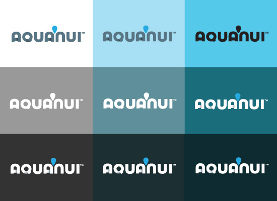
Full-Color
Whenever possible, the logo should appear in its full-color version.
One-Color
The one-color solid version of the logo should only be used when the full-color logo cannot be applied. This is often the case with signage and merchandise.
Reverse Out
When the logo is used on a DARK solid background color, it may be reversed out in white. Generally the logo should only be reversed when no other option is available.
AN Symbol only (Glyph)
The Symbol is a portion of our logo that can be used as a free-standing graphic element without the Wordmark. The Symbol must be used as provided and cannot be altered in any way.

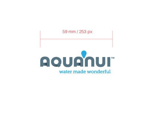
Minimum size
The Minimum size has been carefully established to ensure our logo is reproduced correctly in smaller sizes. At Minimum size, the logo is still clearly legible and provides a strong level of identification. When using a lower-quality printing technique (i.e. screenprinting), it is recommended that the logo be used in a larger size.
Clear space
The Clear space has been established to ensure logo visibility and impact. Maintaining the Clear space zone between the logo and other graphic elements such as type, images, other logos, etc. ensures that the logo always appears unobstructed and distinctly separate from any other graphic elements. When using the logo, allowing it to “breathe” gives it maximum impact. Wherever possible, allow even more space around the logo than required by Clear space. The Clear space is proportional and is based on the width of the logo. The construction of Clear space is identified below.

On backgrounds
When placing the logo on an image, color or pattern, it is essential that there is enough contrast between the logo and the background. The logo must not be placed on backgrounds that distract from or compete with the logo.
Incorrect Usage
To maintain consistency in the application, the logo must not be redrawn or altered in terms of its appearance, components, colors, proportions, or any other property.
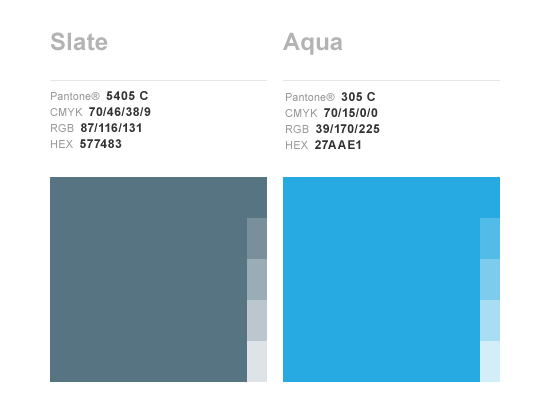
Corporate colors
Our Corporate colors are a distinct and crucial part of our identity as they make our brand instantly recognizable. When applied consistently, our Corporate colors also provide a strong visual link across various materials and communications and set our company apart from the competitors. No colors other than the ones specified below may be used.
Primary colors
Specifications for reproduction of our Primary colors are shown in the image below. The colors are specified for offset printing on white paper (CMYK and Pantone) and for use on computer monitors (RGB). When reproducing the Company colors on a different material, always make sure the colors visually match approved colors.
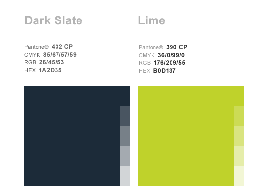
Support colors
In addition to the Primary colors, a palette of complementary, secondary support colors has been developed. The support color palette is intended to be used in conjunction with the primary brand colors to add visual interest and graphic distinction.
Name in the text
When writing the Company name in the text on printed or online materials, always use the correct writing format. Consistency in the writing of the company name shows professionalism and helps build our brand awareness.
Correct: AquaNui
Incorrect: Aqua Nui, Aquanui, aquanui, aqua NUI, etc.
Corporate typefaces
The Corporate fonts are a fundamental part of our visual style that help achieve a unique and consistent look across our materials. The Primary fonts must be used on all printed materials and communications – and if possible, also on the website and online communication.
Headings Typeface
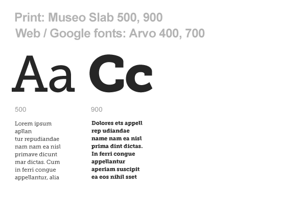
Our headings typeface is Museo Slab when used in print & Arvo when used on the web. The font is available in 2 weights which allow use in bold headlines to easy-to-read subheadings.
This font can be purchased here.
We highly recommend purchasing the “Open type” version of the font because it may be used on both PC and Mac platforms.
For web applications, the Arvo font can be accessed for free here.
Main Body Typeface
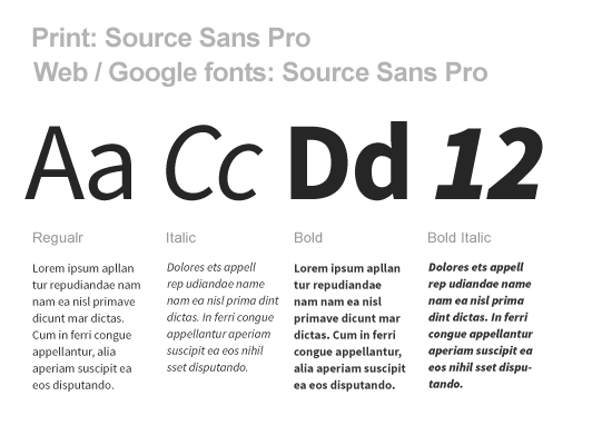
Our main body text typeface is Source Sans Pro. This typeface should be used for main body text or where type will appear in smaller form and good legibility is required. This font can be downloaded for free at adobe.com. We highly recommend purchasing the “Open type” version of the font because it may be used on both PC and Mac platforms.